
CLIENT
The Sivara
TYPE
Academic Project: Branding
YEAR
2025
BRIEF
CONCEPT
The concept explores the connection between India’s timeless musical heritage and the evolving sound of contemporary music. The identity was designed around the idea that traditional and modern music do not have to exist separately they can influence and echo one another. The aim was to create something culturally rooted but visually current, allowing The Sivara to feel like a contemporary music label with a strong connection to its origins.
INSPRIATION
The visual direction was inspired by Indian musical heritage, traditional forms, cultural elements and contemporary music aesthetics. The mood-board brought together references from Indian music, textures, forms, typography and visual culture. These references helped establish a direction that felt earthy, expressive and connected to India while avoiding an overly decorative treatment. Deep earthy tones were explored to create a sense of warmth and cultural connection, while the typography and overall composition were kept contemporary.

SKETCHES
The initial sketches explored different ways of representing rhythm, movement and musical expression through form. Different visual possibilities were tested to understand how Indian musical references could be translated into a more contemporary identity. The exploration helped narrow down the strongest direction before moving into digital development.

DIGITAL SKECTHES
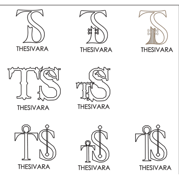
The selected ideas were developed digitally to refine the forms, proportions, typography and overall visual system. Century Gothic was selected as the primary typeface because its clean geometric character created a contrast with the more culturally rooted visual references. This helped the identity feel modern without losing its connection to the concept. The digital stage also helped test how the identity could adapt across different compositions and applications.


FINAL IDENTITY
The final identity brings together contemporary typography, culturally inspired visual elements and deep earthy tones. The result is a visual system that balances India's musical heritage with a modern music-label aesthetic. Instead of directly reproducing traditional imagery, the identity interprets the cultural influence through a more contemporary visual language.


MOCKUPS

